


We’re delighted to welcome Abbie Curd back with another great guest blog, all about bringing colour to your home:
As an interior designer, the subject of colour is very close to my heart; I love researching, designing and creating new colour schemes. However, many of my clients get nervous when it comes to applying colour to their rooms in case they get it ‘wrong’ – what if they don’t like the end result, or the colour doesn’t go with the rest of the room, or it makes the room look dark… but will the room look bland if they stick to their comfort zone of neutrals??!?!
If this sounds familiar, I’ve put together some tips and advice to consider before you apply colour to your room, and I hope it will make the process feel less daunting!
Choosing your colours
So how do you decide which colours to include in your room? Can you simply choose the colours you like, should you consider the rules of colour theory, or in reality, are you limited by other factors?
With so many potential permutations, it’s impossible to provide a one-fits-all formula, but here are some questions to ask yourself.
What colours are you drawn to?
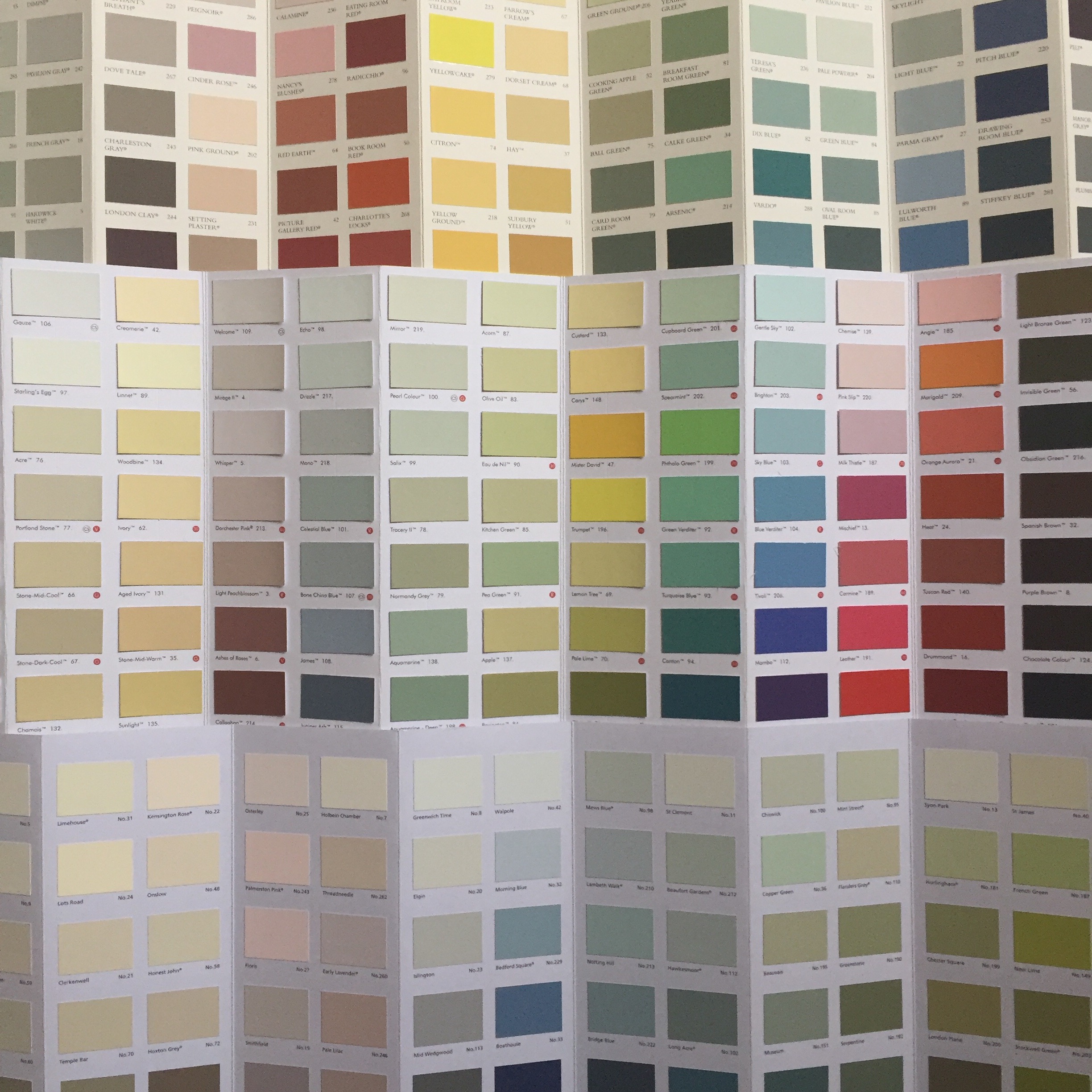
OK, I’ll go first! I’m drawn to a warm grey-green, like Farrow & Ball’s French Grey. If I see a front door, a painted dresser or a ceramic bowl in this colour I instinctively do a double-take; I’m physically drawn to it! This is one of the reasons I designed my logo in this colour, as I love it and it represents me.
So it might seem obvious, but when you’re considering colours for your home, identify the colours that you are drawn to; that make you stop in a shop and pick something up. If this colour is present in your home surely that’s a good thing!
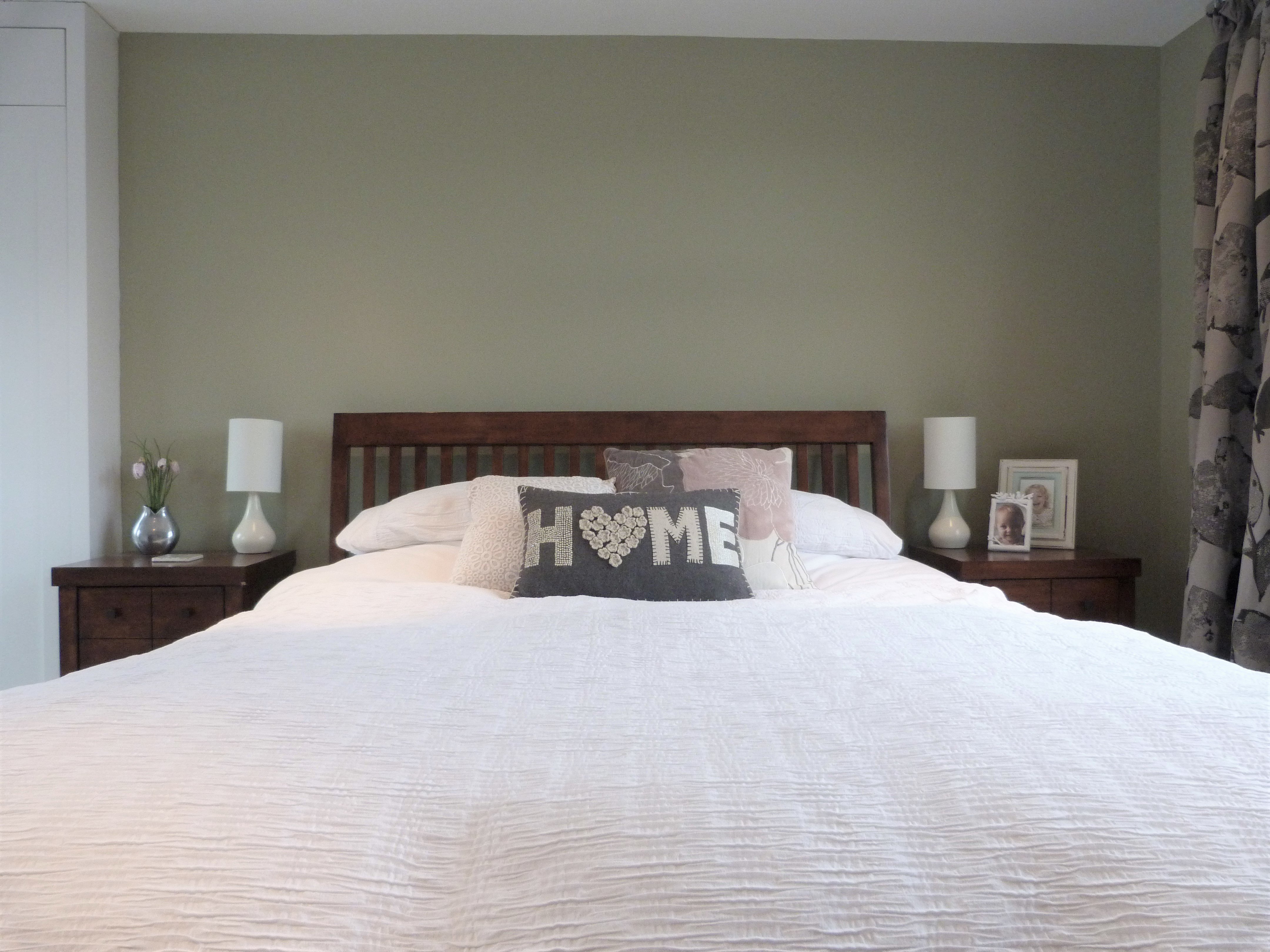
Bedroom wall painted in Farrow & Ball French Grey
How do colours make you feel?
Did you know that from a physiological point of view, colours can evoke a wide range of emotions in us? Warm colours tend to conjure the stronger, more primal feelings, because our brains process these colours most easily; for example, red represents danger, romance and hunger. At the other end of the spectrum, cool greens, blues and purples can make us feel relaxed and even spiritual.
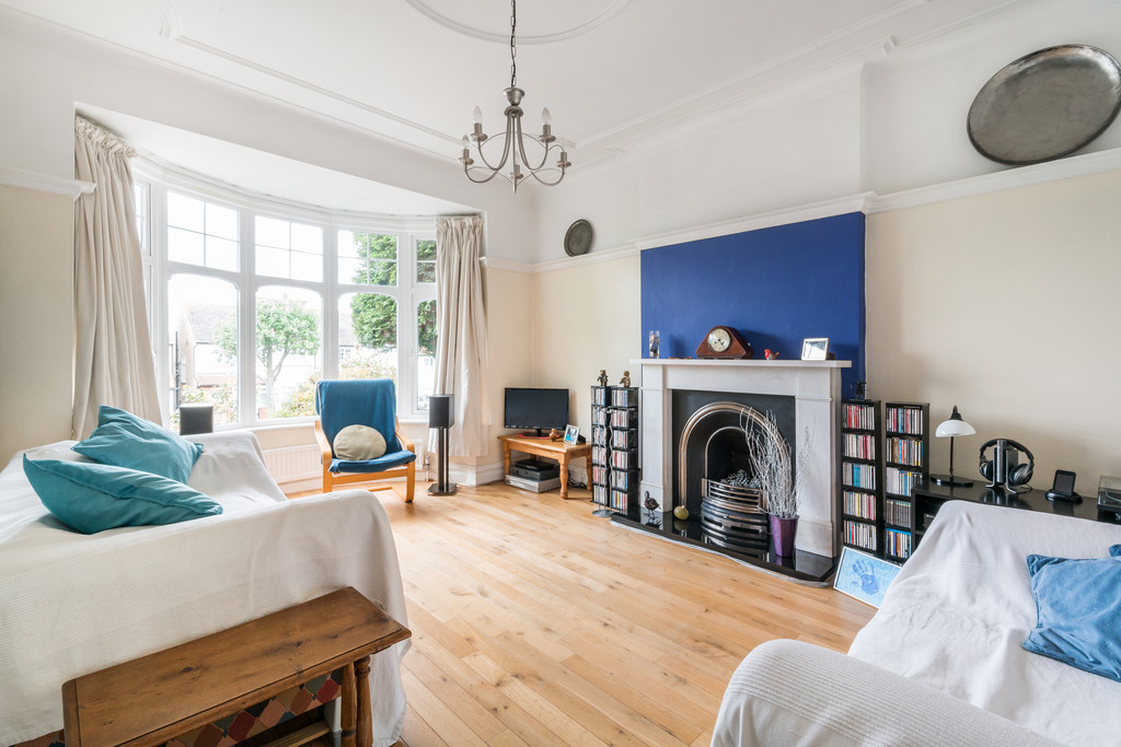
Photo taken by the Move Revolution in house photography team.
So in theory, a blue lounge would ‘work’ because it is relaxing, but of course it will only work if you like the colour in the first place! I always consider this area when advising clients, but as a guideline only, rather than a set of rules.
What colours are already in the room?
If you have existing pieces that will remain in the room, it is advisable to choose colours that will complement these – and in a lot of ways it’s useful to have a starting point.
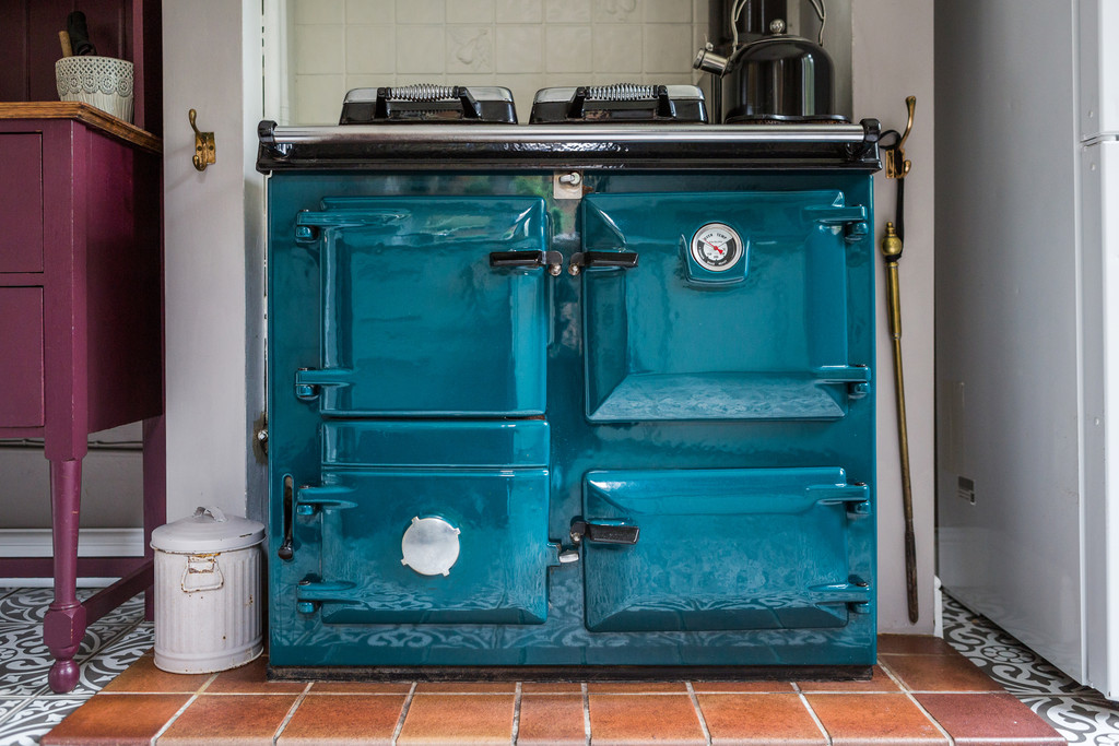
Photo taken by the Move Revolution in house photography team.
One of my clients already had the base of her colour scheme in place, with silvery duck egg blue curtains, off-white walls and stripped floorboards, but she was concerned that the room felt cold. I suggested injecting some warmer deeper colours to provide some balance – deep teal with tiny pops of coral – through an armchair, cushions, prints and ornaments.
Are you persuaded by trends?
Lots of clients ask me if they should follow current trends, and if they do, is their room likely to look out of date within a year. My answer is always the same – if you like something then go for it! Personally I think it is easy to be influenced by trends, as that is what we see in shop displays, in magazines and on social media; all set up to look beautiful and persuade us to buy. If you do like a particular trend you’ll have a wider range of products to choose from, but never feel that you should. One of my clients recently apologised that she didn’t like grey and asked if that was OK! Sometimes with established trends, there is so much of it around that it can give the impression that there isn’t any other choice, but there is always an alternative.
For 2017, the Pantone colour of the year is the acidic green ‘Greenery’, and Dulux nominated a soft grey-blue, ‘Denim Drift’. I recently read an article predicting that ‘Orange is the new Pink’ but that remains to be seen!
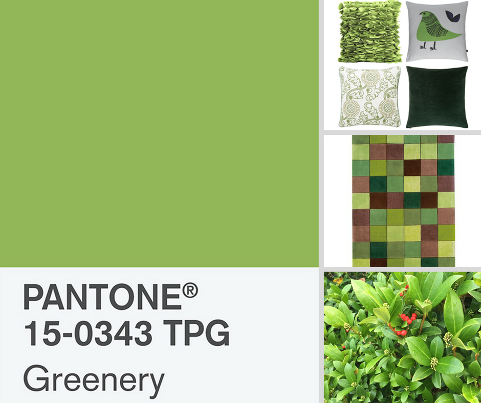
Pantone colour of the year 2017 – Greenery
Does your partner share your taste?
I met a couple recently who are building an open plan kitchen / living / dining room in their home. He is drawn to neutral colours and the industrial look; she prefers a cleaner contemporary feel and loves yellow. So we traded his distressed brown leather armchair for a yellow velvet occasional chair, in exchange for some oversized industrial pendants hanging over the kitchen island.
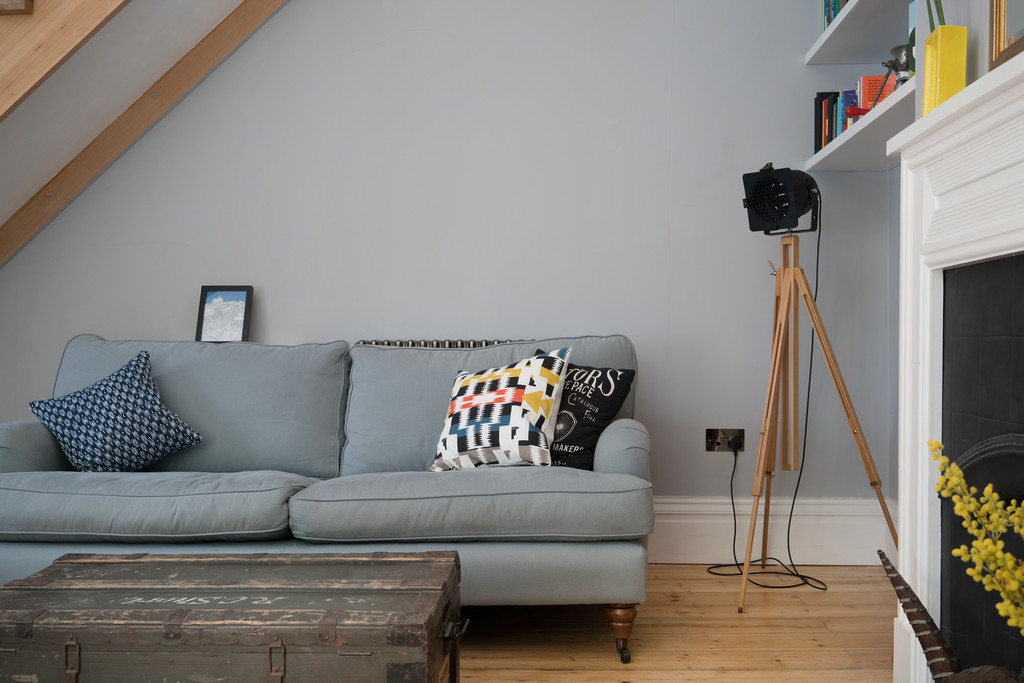
Photo taken by the Move Revolution in house photography team.
There’s always a compromise to reach so both parties are happy!
Creating your colour scheme
So you’ve nominated some colours that you’d like to use in your room; the next step is to define your colour scheme.
Although there are no hard and fast rules, there are guidelines to follow. I tend to use these as a starting point and then love throwing in something unexpected at the end!
The 60-30-10 decorating rule recommends that your main colour makes up 60% of the space (e.g. walls & floors, large sofa), your secondary colour makes up 30% (e.g. accent chair & rug) with the remaining 10% dedicated to the accent colour (e.g. cushions, pictures, accessories).
In reality, most main colours tend to be neutral, i.e. light grey walls and whitewashed flooring, but how to do you choose your secondary and accent colours so they ‘go’?
There are two main types of colour scheme – complementary and harmonious – which are best explained using the colour wheel.
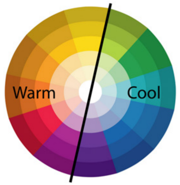
Colour wheel showing the split between warm and cool colours
Complementary schemes use colours that are opposite on the colour wheel, as these colours appear at their most vibrant when placed together. One example is blue and orange; now this may not seem like an obvious choice, but… picture a room with soft grey walls and floors, a dark grey sofa, a warm navy armchair and patterned rug, with copper lights and picture frames… are you convinced?
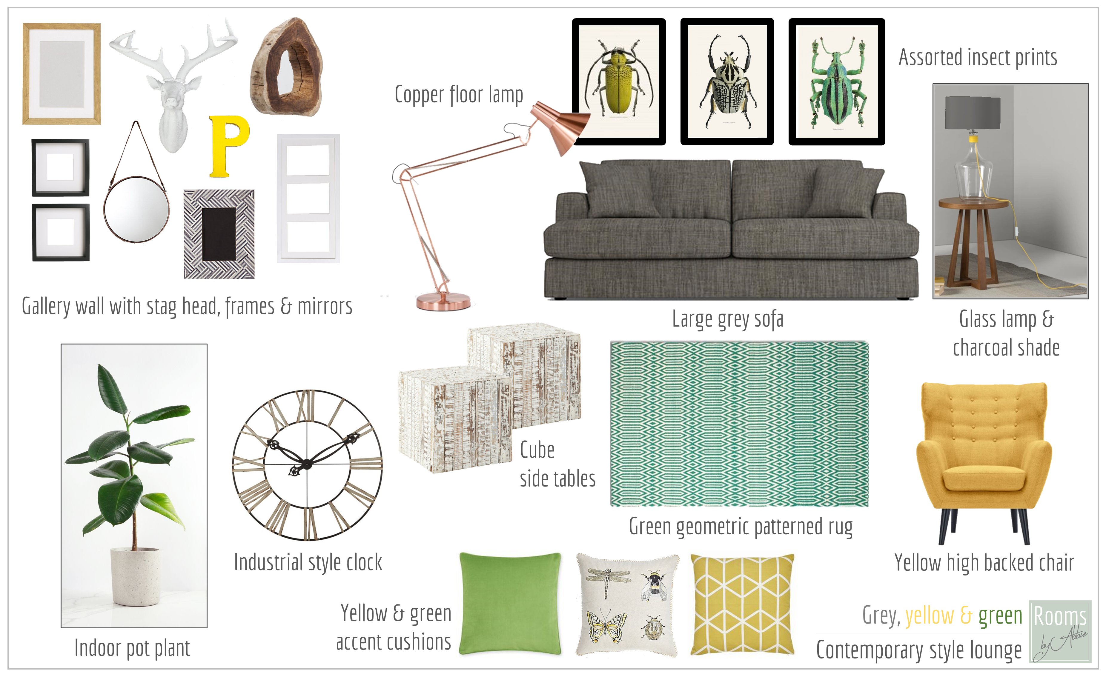
Harmonious schemes use colours that are adjacent on the colour wheel, and create a more relaxing environment than vibrant complementary schemes. Take this Design Concept board I created for one of my clients as an example – by adding yellow and green to a neutral background, a fresh yet relaxing feel is created, balanced by using elements from both the warm and cool side of the colour wheel.
So what are you waiting for?!
If you still feel nervous, try adding small splashes at first in the form of accessories, such as a ceramic vase, a brightly coloured print or some cushion covers. If you have neutral walls and furniture, brightly coloured accessories will ‘pop’ and make a real impact. This experimentation doesn’t need to be costly – there are lots of affordable retailers like Ikea, Dunelm, and most supermarkets sell homewares.
Once you’re feeling braver and have established your colour preferences, you may want to increase the amount of colour in your room, which could be done by adding an accent chair or rug. You can also experiment by painting old furniture using chalk paint – you can apply it directly to the furniture without any sanding or priming so is quick and easy to do. And who knows, you may soon be painting your walls too!
So go for it! The worst that can happen is that you don’t like it and you can paint over your walls and sell your accessories – you’ll never know unless you try…
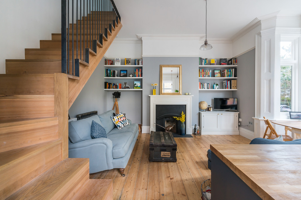
Photo taken by the Move Revolution in house photography team.
If you’d like to book an appointment with Abbie, see the Rooms by Abbie website for details.
If you’re thinking of moving, the Move Revolution team would love to hear from you on 0330 223 1000.